

How to Use Pivot Tables in Google Sheets
Pivot tables are a powerful feature that allows you to summarize and analyze complex datasets for an extra layer of insight that spreadsheets are missing. For example, they can help you group sales by region, calculate profit margins, or compare year-over-year performance across product lines. This guide will show you how to use pivot tables in Google Sheets for data analysis.
When to Use Pivot Tables
A quick glance might be all you need for small spreadsheets to understand the data. But as your dataset grows larger and more complex, finding patterns and making sense of the information gets trickier. And that’s where pivot tables shine.
Learning how to use pivot tables in Google Sheets is essential if you work with large datasets. This feature is designed to help you organize and analyze data efficiently, transforming rows and columns of raw data into actionable summaries and insights.
For even larger or more intricate datasets, Enquery is an ideal solution. It’s an AI-powered platform that can automate data organization and analysis and lets you chat with your spreadsheets, eliminating traditional pivot tables' limitations. Try Enquery FREE for 30 days.
Setting Up for Success with Pivot Tables
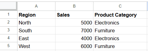
Before creating a pivot table, it’s essential to organize your data. Clean, structured data will ensure your pivot table works seamlessly and produces accurate results.
Ensure your data is in a tabular format with clear column headers (e.g., “Region,” “Sales,” “Product Category”).
Remove blank rows or columns and format data consistently (e.g., dates should follow the same format).
For example:
How to Create a Pivot Table in Google Sheets
The first step is to navigate to the Pivot Table option and set it up.
1. Select Your Dataset
Highlight the range of data you want to analyze. Ensure it’s organized with headers.
2. Navigate to Pivot Table Creation
Click on the Insert menu in the toolbar.
Select Pivot Table from the dropdown options.

3. Choose Placement
In the dialog box that appears, decide whether to place your pivot table in a new sheet (recommended for clarity) or in an existing sheet.

Click Create, and the pivot table editor will appear on the right side of your screen. This editor allows you to customize how your data is summarized and displayed.
Understanding the Layout
Rows: Define the categories displayed vertically. For example, add “Region” to Rows to group and analyze data by geographical area.
Columns: Group data horizontally, such as adding “Product Category” to Columns to compare performance across categories.
Values: Calculate metrics such as totals, averages, or counts. By default, Google Sheets calculates the sum of the selected field, but you can change this using the dropdown in the pivot table editor (e.g., switch to average or count).
Filters: Narrow down the dataset by applying criteria. For instance, filter the data to show sales only for a specific product or region. This flexibility is a key reason why understanding how to use pivot tables in Google Sheets is so beneficial for managing large datasets.
How to Edit Your Pivot Table in Google Sheets
When Google Sheets first generates your pivot table, the Pivot Table Editor panel automatically opens on the right-hand side of your screen. This is where you can customize and refine your pivot table to display the exact insights you need.
Note that if the Pivot Table Editor closes for any reason, you can reopen it by hovering over the pivot table and clicking Edit to bring it back. This allows you to make adjustments at any time without starting over.
Using Suggested Data Analyses
Google Sheets often anticipates the insights you’re looking for with its Suggested feature in the Pivot Table Editor. It will provide pre-built recommendations based on your dataset.
Normally, the section is open by default. However, you can view suggestions by clicking the down caret (∨) next to Suggested in the editor panel.
For example:

Clicking on any suggestion will instantly build the pivot table with fields and calculations for you. If the suggested analysis doesn’t fully meet your needs, you can modify the table by adjusting fields and settings in the editor panel.
How to Customize Your Pivot Table in Google Sheets
The real power lies in customization. Google Sheets provides various options to shape your pivot table and ensure it fits your exact needs. Some of the things you can do include the following.
Sort and Rearrange Your Data
With the sorting feature, you can sort rows or columns by text, numbers, or metrics like total revenue or average sales. You can also drag and drop labels in the Pivot Table Editor to rearrange them exactly how you want.
To use sorting in Google Sheets:
Click anywhere inside your pivot table to open the Pivot Table Editor.
In the Rows or Columns section, click the dropdown arrow next to Sort by.
Select the field by which you want to sort and choose Ascending or Descending order.
To rearrange labels:
Drag and drop the fields within the Rows or Columns sections In the Pivot Table Editor to reorder them as desired.
Fine-Tune with Filters
Filters help you focus on just what matters in a large dataset. You can zoom in on specific things like years, regions, or product categories. Or exclude anything that might skew your analysis, like outlier data or smaller segments you don’t need right now.
To use filtering:
In the Pivot Table Editor, locate the Filters section.
Click Add and select the field you want to filter by.
Choose the criteria for filtering, such as specific values or conditions (e.g., Greater than or Text contains).
Switch Up Calculations
As noted earlier, Google Sheets sums your data by default, but you can change that to averages, counts, or even maximum and minimum values. For example, you could switch to Average if you want to track trends or go with Count to see how often something appears.
To change the summary function:
In the Pivot Table Editor, go to the Values section.
Click the dropdown arrow next to the field you want to adjust.
Under Summarize by, select the desired function, such as Sum, Average, Count, Min, or Max.
Build Your Own Metrics
Sometimes, the default options aren’t enough. In those instances, you can use calculated fields, which allows you to create formulas for the exact insights you need.
For example, you can use a formula like =Sales – Costs to see your profit margin. Similarly, you can build a percentage-based formula to compare year-over-year growth.
To add a calculated field:
In the Pivot Table Editor, click Values > Add > Calculated Field.
Enter your custom formula using the appropriate field names (e.g., =Sales - Costs).
The calculated field will appear as a new metric in your pivot table.
Make Your Pivot Table Easy to Read
Google Sheets offers tools to format your table for clarity and impact.
You can use conditional formatting to highlight key figures, such as marking sales above $10,000 in bold green. You can also adjust fonts, colors, and borders to create a clean, professional look that’s ready to share.
To apply conditional formatting:
Select the cells within your pivot table that you want to format.
Go to Format > Conditional formatting.
Set the formatting rules based on your criteria (e.g., highlight cells greater than a certain value).
To adjust fonts, colors, and borders:
Use the toolbar options or go to Format to change font styles, cell colors, and borders as needed.
Expand or Collapse Data
It can feel overwhelming when your pivot table gets large. Use the expand/collapse feature to control how much detail you see at once. For example, you can show just the total sales by category and hide all the subcategories for a cleaner view.
This feature keeps your analysis adaptable, so you can shift between big-picture insights and detailed breakdowns.
To expand/collapse:
In your pivot table, click the + or - icons next to grouped data to expand or collapse details as needed.
Refresh for Real-Time Accuracy
If your source data changes, your pivot table can stay current. Typically, Google Sheets automatically updates data whenever something changes. However, there are instances where the pivot table may not reflect new data immediately.
In such cases, manually refreshing your browser page can prompt the pivot table to update. Simply press the F5 key or click the refresh button in your browser.
If your pivot table isn’t updating, it might be due to one of the following.
Data Range Issues: Ensure the data range includes all new data entries. If new data falls outside the specified range, the pivot table won't capture it.
Filters: Existing filters might be excluding new data. Review and adjust filters to ensure they encompass all relevant information.
How to Read a Google Sheets Pivot Table
Reading a pivot table may seem daunting at first, but once you understand the structure, it’s all about interpreting the data. Each component of the table—rows, columns, values, and filters—plays a role in shaping the story your data tells.
Let’s start with the rows and columns, which define the structure of your pivot table.
Rows typically display categories or groupings, such as product names, regions, or time periods, while columns are used for comparative dimensions. For example, if your rows show product categories and your columns represent sales regions, you’re looking at how different products perform across various locations.
Values contain the calculations that summarize your data. These could be totals, averages, or counts, depending on what you’ve selected during setup. For instance, if your pivot table shows total sales by region, the numbers in the value cells represent how much revenue each region has generated. If grand totals are included, they’ll show overall performance across all regions or categories, offering a quick snapshot of your data.
As you read a pivot table, look for patterns or anomalies. Are certain categories consistently outperforming others? Are there regions where sales are unexpectedly low?
Pivot tables are great for identifying trends, such as seasonal spikes or declining performance in specific areas. Pay attention to subtotals and grand totals, as they can help you quickly compare contributions across categories or highlight the biggest contributors to your overall metrics.
Finally, consider how filters might impact the data you’re viewing. If a filter has been applied, the table might show only a subset of your dataset—such as sales from a single year or transactions from a particular region. Understanding what’s included (and excluded) ensures that you interpret the table accurately and within the right context.
Pivot Tables Made Easy with SQL + AI
If you’ve ever experienced Google Sheets crashing or becoming unresponsive, you’re not alone—and there’s a better way. This is where data management systems shine.
Relational databases, powered by SQL, allow you to store and retrieve data quickly and securely. But if SQL sounds complex, don’t worry. With Enquery, you don’t need to be a data scientist to take advantage of these advanced capabilities.
Enquery is an AI-powered SQL solution designed to simplify complex data workflows. It allows you to connect directly to your spreadsheets or databases, write SQL queries using plain English, and automate tasks like deduplication, data merging, and advanced calculations. Plus, Enquery keeps everything secure on your local machine, unlike traditional SQL tools.
Start unlocking powerful insights without manual data crunching or complex setups today. Try Enquery FREE for 30 days and experience the smarter way to work with your data.
FAQ: How to Use Pivot Tables in Google Sheets
Still have questions? Here are some frequently asked questions about how to use pivot tables in Google Sheets.
Can a pivot table pull from multiple worksheets?
Yes, but not directly. Google Sheets requires consolidating data from multiple sheets into a single range before creating a pivot table. You can achieve this by using functions like QUERY or IMPORTRANGE to combine data into one sheet.
How do I create a dynamic pivot table in Google Sheets?
To create a dynamic pivot table, ensure your source data range automatically updates as new data is added. You can do this by using dynamic named ranges or setting the data range to include entire columns (e.g., A:E instead of A1:E100). This way, your pivot table will include new data without manual updates.
Can I have two pivot tables in one sheet?
Yes, you can create multiple pivot tables in a single sheet. Ensure they are placed in separate areas to prevent overlap, which can cause errors. Specify the location for each pivot table during creation to maintain clarity and organization.
Can I merge two pivot tables?
Google Sheets doesn't support merging pivot tables directly. To combine data from two pivot tables, consider consolidating the source data into a single dataset and then creating a new pivot table. Alternatively, you can use functions like QUERY to combine the results from multiple pivot tables into a single view.
How do I get the pivot table toolbar back?
If the Pivot Table Editor disappears, click anywhere inside the pivot table to bring it back. If it doesn't reappear, you can access it by selecting the pivot table and clicking on "Edit" near the table or by navigating to Data > Pivot table from the menu.
You may also like this: How to Locate Duplicates in Excel


